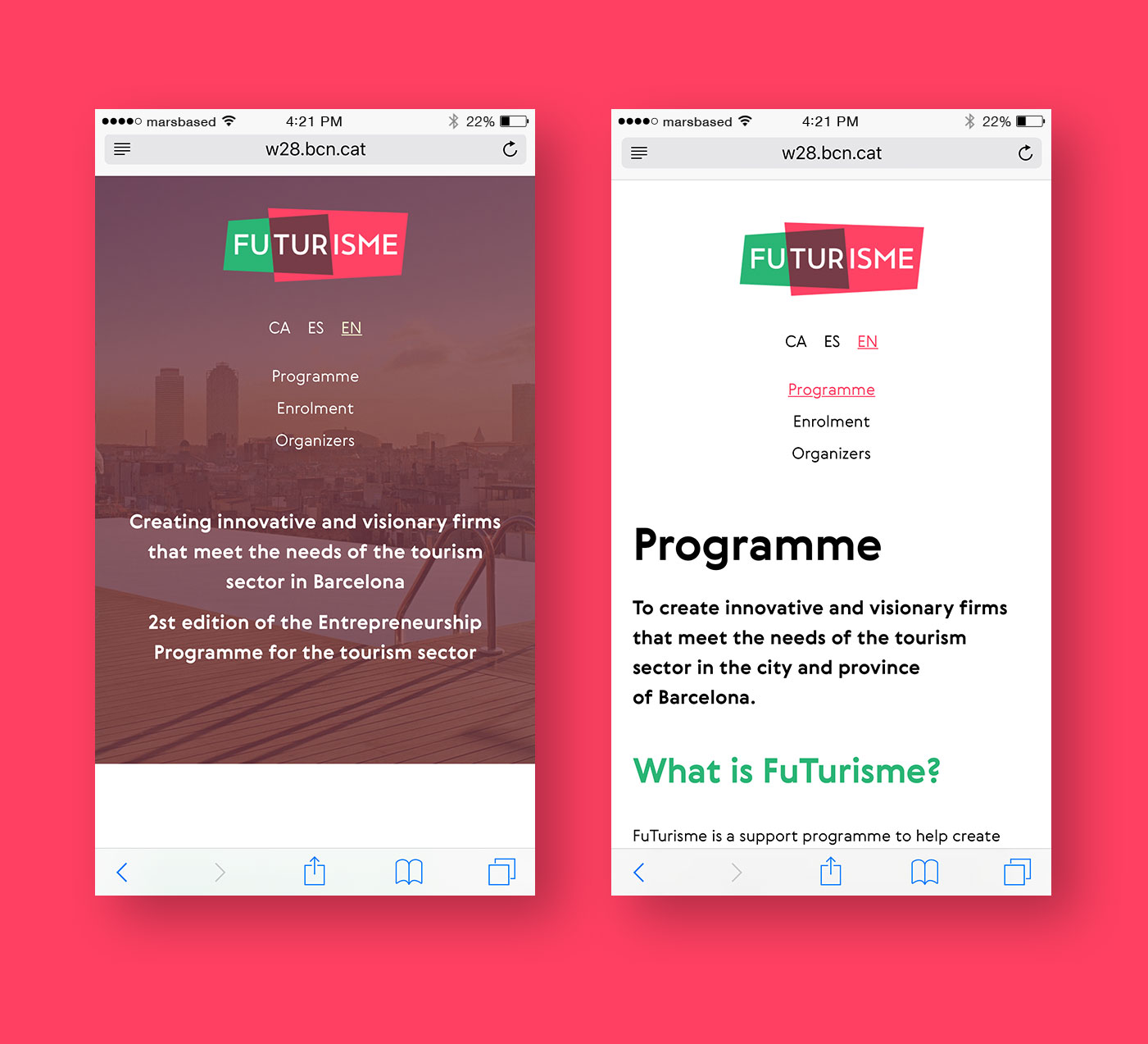
FuTurisme
FuTurisme was a new customised programme for entrepreneurship in the tourism sector to meet the needs of this business area, and is organised by The City Council, Diputació de Barcelona, the Catalan Association of Specialized Travel Agencies (ACAVe) and Barcelona’s hotels association (Gremi d’Hotels de Barcelona).

Because of our involvement with the city of Barcelona, through the development of the Barcelona Startup Map, and our good relationship with Barcelona Activa, we were contacted to design and develop a brand new static site for this entrepreneurship programme.
The requirements for the site were clear from the get-go: our client needed a website with a ground-breaking design that shouldn't require any maintenance at all.
The main reason behind choosing a disruptive design is because they wanted to break away from the institutional looks they're usually associated with - remember that Barcelona Activa is a department within the Barcelona City Council - and because they're targeting entrepreneurs. Thus, a fresher look was required.
Last, but not least, the programme takes place in Barcelona, and therefore that should be the main focal point of the design.
Let's describe how we came to the concept for the design.
Taking into consideration that Barcelona should be the main element in the mix, we drew inspiration from Antoni Gaudí's most iconics works. Antoni Gaudí was a Catalan architect from Reus and the best known practitioner of Catalan Modernism, mostly known for his masterpiece La Sagrada Família, and other works like La Pedrera, Park Güell or the lampposts on Plaça Reial, in Barcelona.
Some of the elements on the website, such as the logo or the way we broke down the different blocks on the homepage, draw inspiration from Gaudí's trencadís. We also included Gaudí's motives throughout the website, such as the famous Park Güell lizard on the frontpage.
Another thing worth mentioning, is that we oriented the design to tablet/mobile devices first. This way, the website doesn't have small clicking areas hard to tap on a mobile screen, and most of the content is accessible by scrolling or on a first level of navigation.
Working with MarsBased is simply a pleasure. They're fast, agile, and they understood our needs and limitations from day one.

Project tech stack
Middleman
Middleman is a static site generator using all the shortcuts and tools in modern web development.HTML5 & CSS
As a purely informational site, no technical complexity was used, so we could build it only with HTML and CSS.Github Pages
Github Pages is a tool to host public websites hosted on public-facing Github repositories, ideal for static sites.
Because one of the main requirements requested by the client was that the website had an easy or even non-existant maintenance, we built it using Middleman.
Middleman provides an effective and efficacious way of building static sites using a Ruby on Rails foundation, and it is compatible with most standards we use in other projects (YAML, SASS, Markdown, ERb templates, etc.). Once we've built the site structure and chopped the layouts, the site compiles to a static HTML/CSS/JS site ready for delivery and deployment. Furthermore: sites built with Middleman can be easily hosted in any kind of hosting provider, Github Pages or even Dropbox!