How to create icons correctly aligned with the text
Captain's log, stardate d116.y40/AB
There's a pretty shitty annoying problem with icons when working alongside text. It's called alignment.
The CSS box model does not contemplate that an element generated with a width and a height can be part of the line spacing, so they do not end up centring well without cheating.
Nor have I found any property allowing inheritance of the height as interpreted by the text from a custom element.
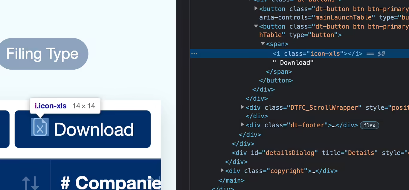
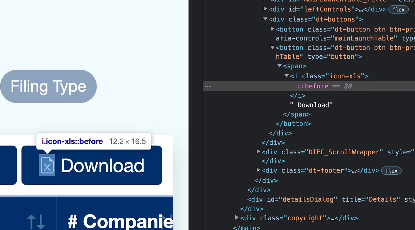
To understand the problem, we can see these two images. What's in blue corresponds to the line-height.
First the icon element:

And now, the text label itself:

As you can see, they're not exactly aligned, and while for a lot of people this is acceptable, we always look for pixel-perfect designs.
To solve this misalignment, we create the icon using text with a before, so we don't have to specify either width or height, and it can continue to be inline. To simulate the icon, we use the letter M, which is the letter used for spacing in the designs.
In this way, being a text element, it sits correctly on the baseline, and we can replace it without problems with the mask. We have not found a better solution, but I'm sure there has to be something better than using a before and duplicating the selectors.
For future projects, we will create the icon selector and another selector to specify the icon to use, which is going to be a more elegant solution. In the meantime, you can use this solution to get this out of the way!

The code is the following:
.icon {
  display: inline;
  background-color: currentColor;
  mask: var(--icon) center/contain no-repeat;

  &::before {
    content: "M";
  }
}

Find out how we organise in our frontend projects and the tools we use.
Read full article
Two options for one of the biggest debates in the frontend world.
Read full article
So all of the sudden the social sharing buttons disappeared from your website? AdBlock is probably at fault, and here is how to fix it!
Read full article