How to build CSS grids: floats vs inline blocks
Diario del capitán, fecha estelar d447.y36/AB
Diario del capitán, fecha estelar d447.y36/AB

At MarsBased we're very keen on sharing everything we learn. That's why we recently published our HTML & CSS Guidelines, our blogging tips or the lessons learnt in our first year running the company, among other stuff. In this entry, you will learn how to build CSS grids by comparing the two most popular approaches.
When you're building anything in CSS (a header, a form or a grid, just to name a few) the first thing you need to consider is how elements will react with each other. That's how the flow of the document works: you put elements next to each other and you tell them how to behave. Some properties you attach to an element have an influence on the elements beside it.
Let's say you want to build a simple 3-column layout like this one:

First you write your HTML, which in this case is very simple:
<div class="row">
  <div class="item">item</div>
  <div class="item">item</div>
  <div class="item">item</div>
</div>
And for the CSS, the most common way to tackle this is to float these elements, which means:
.item {
  display: block;
  width: 33.33%;
  float: left;
}
This means all objects will float to the left in relation to each other. The first problem that we get here is this:

So, now, their parent .row doesn't have a height, because floating an object means it will only "interact" with others that are floating. .row is not floating, so it will not take its floated child elements into account. To overcome this, we have to start "hacking" using one of the following options:
overflow: hidden; to the parent. This may work as intended in our example, but maybe you can't use this, but you may need to have a different value for overflow for some other reason..row. This way, because it is floated, it will take its children's height into account and properly grow as needed. But maybe this option isn't available for you either, in which case it's getting difficult to overcome this..row to display: inline-block;, which will also take the children into account, but maybe you need it to be display: block; for some other reason.:before and :after) to the parent .row and set them as display: table; and clear: both; to fix this. But, then again, if you also want to add some pseudo-element to do something else visually, this is not an option for you.One of these is bound to solve the parent height problem.
So, let's say this is fixed and you want to add more items and build something like this:
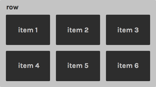
And because the web is not static and you'll never know how big the content of the .item elements will be (unless you force it), you can have items with different heights. If that's the case, this will eventually occur:
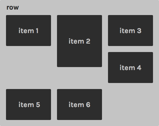
Item 3 is smaller than Item 2, so Item 4 will be rendered under 3, and that's not right. So here we get back to "hacking", we need to make it so every third item starting from the fourth is forced to jump to the next line:
.item:nth-child(3n+4) {
  clear: left;
}
But if, suddenly, we want to have 4 columns, we have to change that rule as well. This is not ideal.
As we've seen, using floated elements has its quirks or may not be an option for you, so let's see how you can use inline-block as an alternative.
Just to give you a quick intro, display: inline-block; makes elements flow like text though each one will still be a block (in contrast, if you use display: inline; your elements will flow like text but will not have width or height, only the dimensions of its contents). This means that elements put side-by-side will display side-by-side as long as they fit within their parent.
That said, let's do this:
.item {
  display: inline-block;
  width: 33.33%;
}
This method also needs a small hack to circumvent the following problem:
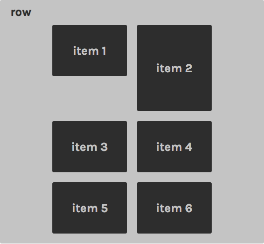
What is happening here is that inline-block elements behave like words and, as words, they have word-spacing, which is a natural space between words. To overcome this, you can either reset the font-size on the parent (my favourite way, but with some shortcomings when you use ems or % for font-size)
.row {
  font-size: 0;
}
.item {
  font-size: 1rem;
}
Alternatively, you can adjust the word-spacing:
.row {
  word-spacing: -4px;
}
The word-spacing value depends on the typeface you are using, but the rule is to always use the smallest negative spacing possible. And now we have a perfect grid:
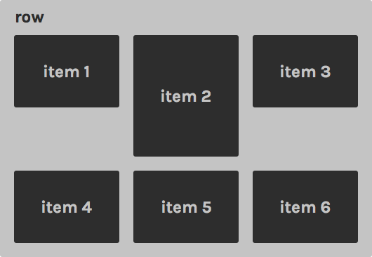
Why is this better? For one, you can change the number of columns without running into the layout issues we looked at earlier. But the best thing is being able to align items vertically:
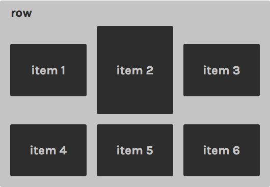
Just by doing this:
.item {
  vertical-align: middle;
}
Isn't that great? There's no good way to do that with floated elements. You can also set vertical-align to top, bottom or baseline, among others, depending on what you want to achieve.
You can also set the container to text-align: center; to achieve this:
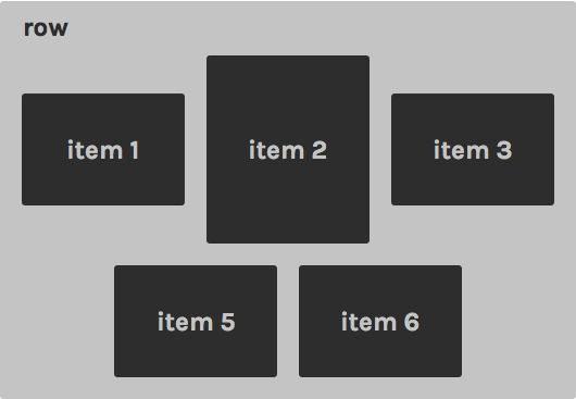
This is useful for dynamic content where you don't know how many items you will have.
There's not one good way to do it, that's the problem and beauty of web technologies! There are loads of ways to do each and every little thing, but there are always nuances that lead you to choose one or the other. At MarsBased we use a mix of these two. We mostly use floats because we use Bootstrap's grids to build general layouts, but we sometimes resort to use the inline-block technique when we need to.
There are also some CSS grid systems based on inline-block that are worth taking a look at:
But the future is very promising, and we're keeping an eye on Flexbox, which gives us new ways to address these issues. Maybe the next front-end post will be about forgetting all of this and using the Flex Box model instead!

Find out how we organise in our frontend projects and the tools we use.
Leer el artículo
As our company grows, so do our projects and clients, and not all of them can be developed with out-of-the-box solutions. Thus, we created a bespoke frontend framework for ourselves.
Leer el artículo
How to check if a technology is the best fit to add it into your tech stack.
Leer el artículo