How we created our own frontend framework: MarsMan (and why)
Diario del capitán, fecha estelar d164.y37/AB
Diario del capitán, fecha estelar d164.y37/AB

2016 was a really challenging year for MarsBased. Throughout the entire year, we worked on about 16 different projects, and even though I joined as a full-time employee in June, I've been involved in most of them in the design, UX and frontend development phases.
Switching projects isn't always easy, especially when dealing with different clients who have different tech stacks and libraries in every project, or even visual guidelines.
Luckily enough, we came up with the idea to standardise the visual elements we're using throughout all our projects and grouped them in a library of our own: MarsMan.
After having successfully completed lots of projects using Bootstrap as the main frontend framework, we found out we spent more time installing it and tweaking to meet our needs than what we saved by using it. While it is really helpful to get some projects - and starting companies - off the ground, it is easy to outgrow Bootstrap once you get more and more complex projects.
Let's list the reasons why we thought it was a good idea to move away from Bootstrap:
Because of all the aforementioned reasons, we thought that creating our “own Bootstrap” could be a way of being more agile, productive, and happier frontend developers.
However, by no means, I want to make you think that Bootstrap is not a great tool. It indeed is, but it just doesn't cut it for us anymore.
"If you don't like something, change it; if you can't change it, change the way you think about it." ― Mary Engelbreit
In this case, we could change it, so why shouldn't we do it? ;)
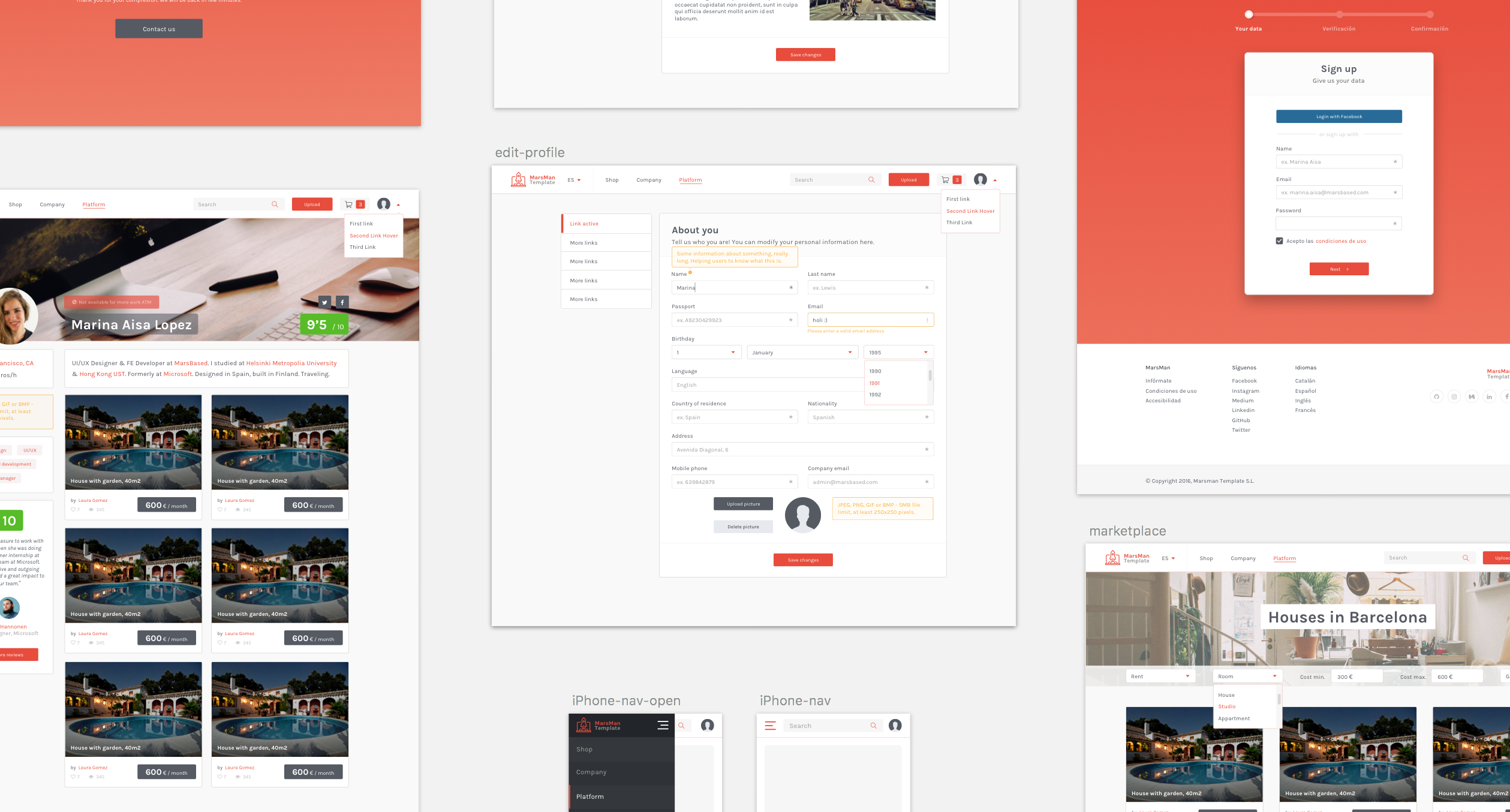
MarsMan is an internal project we started in September 2016, consisting in a frontend templating framework with all the visual elements we needed for our web projects. While it doesn't cover 100% of all the possible functionalities and/or screens a project might have, it does contemplate most cases: forms, dropdowns, marketplaces, lists, search boxes, filters, shopping carts, and a long, long list.
We christened it “MarsMan” because we’re building static sites with Middleman, our static site generator of choice. It also sounds like the kind of name David Bowie would've chosen.
The aim of MarsMan is to offer a structured, exhaustive, and professional design to clients who'd rather invest more in features than in the looks of the app. Ideal for projects that do not require a 100% bespoke design: early stage startups, MVPs, proofs of concept, internal apps, etc.
When I started the design of MarsMan, I thought through what design paradigm would fit better this project. Such a big project required a very flexible methodology that would make it easy to customise it for our future clients, like editing fonts, colours, and some particular elements to match the client’s branding and visual guidelines.
After contemplating several options, I found Atomic Design to be the best.
Atomic Design is a design process created by product designer Brad Frost that consists in breaking down graphic interfaces and their elements into atoms, molecules, and other structures. By combining all these structures, it's easy to devise coherent visual elements for any given app or website.
This method doesn’t only make the design well-organised, but it also makes it easy for the developer to code it afterwards. Because everything is so detailed and coherent, very little extra information is needed from the designer, thus reducing back-and-forth conversations between the design and development teams, ultimately increasing the company's productivity. Atomic Design actually helped me to improve the working processes of the rest of the MarsBased team.
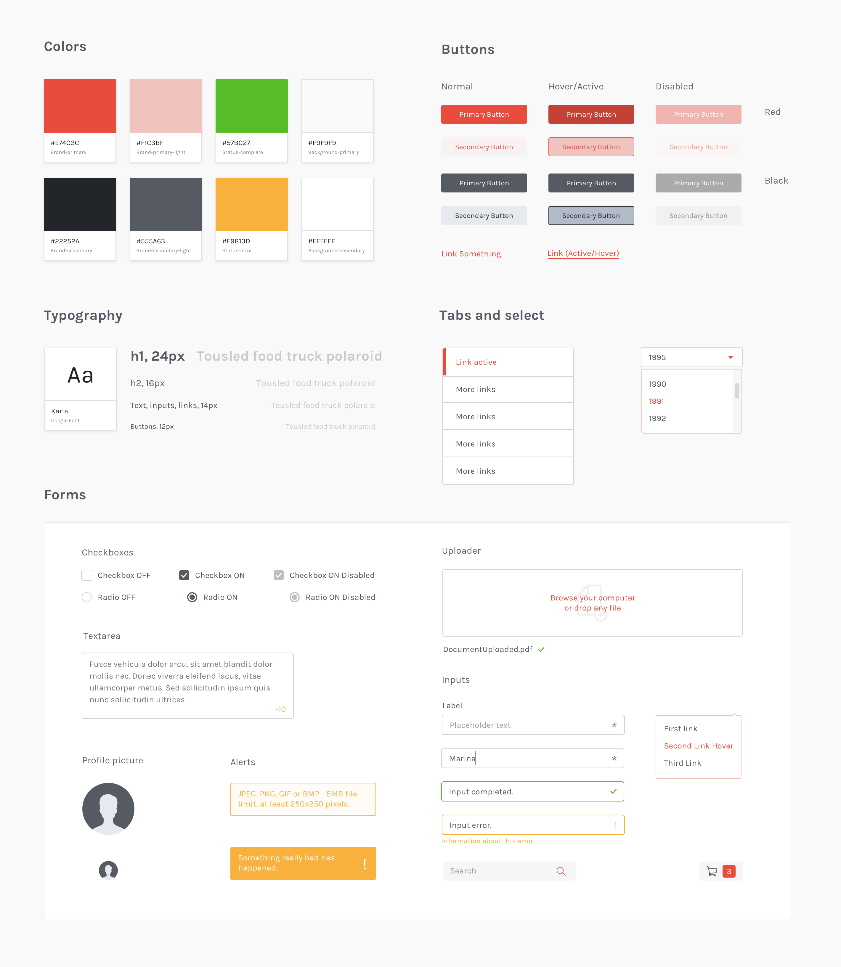
Let's dive into it: to implement Atomic Design, I created a toolkit containing all the molecules needed to create all the visual elements of the project. You can see MarsMan's toolkit here:

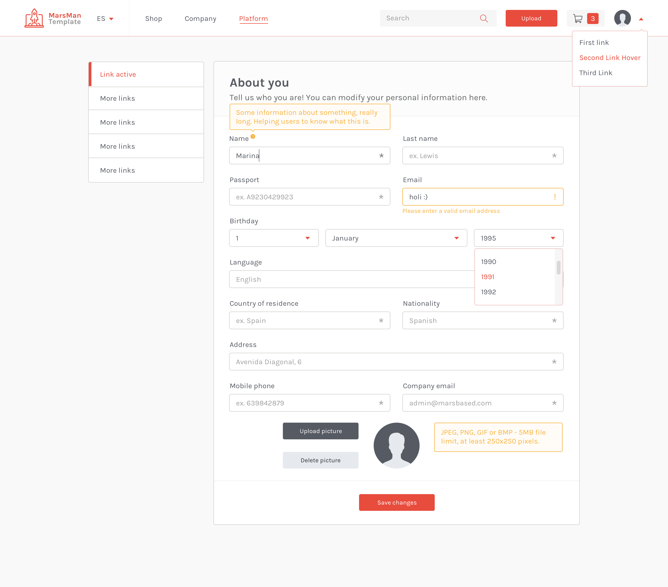
Afterwards, I designed the final organisms using the molecules from the toolkit. This is the "edit profile" page built with our toolkit:

After having a good design with a detailed toolkit and components, we needed to code them in a similar method, so that they could be easily reusable.
We opted for the CSS methodology called BEM. BEM is about creating individual CSS elements that can be modified using general variables, but at the same time, they're so loosely coupled that they can be reusable without depending on other components.
To learn more, read about BEM on their website.
A quick summary for other UI/UX designers: “BEM is to CSS, what Symbols is to Sketch”.
The first project where we used MarsMan was TrustRight. TrustRight is a company that helps people struggling with student loan debt to cut through the red tape and confusion caused by the US federal government's myriad programs.
In this project, we had to transform their desktop application into a webapp project. And since the feature set was very large, we both agreed that our template was a good solution to avoid spending too much on the look & feel of the platform, thus being able to invest it on the feature side.
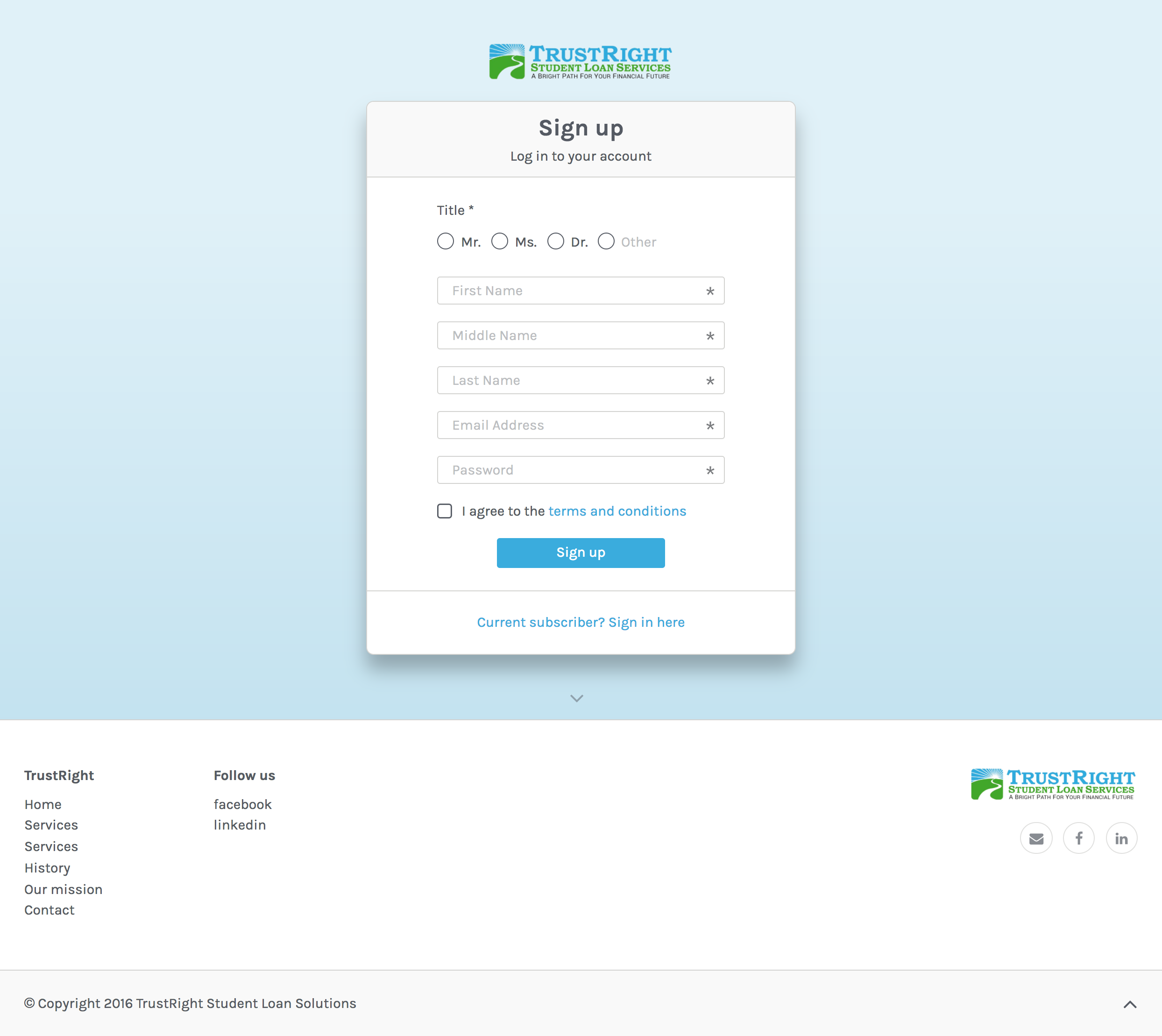
We adapted MarsMan to fit their corporate identity and we developed all the extra elements MarsMan didn't initially contemplate and the result has been very cool.
This is an example of how MarsMan looks on a real project:

Now that we have presented MarsMan to our clients, we often get the following question: should we just then use MarsMan for the design and not invest in a bespoke one?
There's no right answer to this question, I'm afraid. For some projects, it will work, by saving some money that you can reinvest in other areas (sales, marketing, other features or hiring) while some others will require a customised design because of the project's very nature.
If you still need to decide, the following considerations can help you:
When should you use MarsMan in your project:
In short: MarsMan provides a good-looking design, albeit a tad generic. This can be good to minimise the learning curve of your site since users will already be familiar with other popular apps and websites.
When should you use a bespoke design:
In short: if you really want to innovate and create bleeding-edge concepts, pages or new forms of interaction, you must really go for tailored designs, like the ones we do at MarsBased! We love challenges. There is nothing that our team can't do.

I hope I have helped you to decide whether to go for a bespoke design or not and that you liked learning about our project!
By the way, we are hiring! If you want to join our frontend development team, make sure you check out our Jobs page!

Find out how we organise in our frontend projects and the tools we use.
Leer el artículo
Two options for one of the biggest debates in the frontend world.
Leer el artículoThere's a pretty annoying problem with icons when working alongside text. It's called alignment. So, in this blog post, we will show you how we solve this all too common problem.
Leer el artículo